
MADE FOR PLANNER LOVERS & PEOPLE TIRED OF MONEY FLYING OUT THE WINDOW
Print Like A Pro – Printing Made Easy & Fun
PLAN • SCRAP • PRESERVE


Welcome, Fellow Planner (Chaos) Enthusiast! 🎉
Congratulations on downloading the ZIP file of your new obsession – the delightfully distressed, slightly grumpy vintage planner collection! This vintage planner print guide is here to make sure your faded treasures come to life without a hitch. You’ve just welcomed a charming piece of faded nostalgia into your life. But before you unleash this beauty onto your printer, let’s ensure that the magic of these pages doesn’t get lost in translation. That’s exactly what this vintage planner print guide is all about.
Get ready to transform your printing experience from a potential disaster into a delightful adventure – because who said printing couldn’t be fun? In this comprehensive planner print guide, I’ll walk you through every detail to keep the romance alive while printing your planner refill pages. Let’s dive in!
- Step 1: Unzipping Your Vintage Treasure
- Step 2: Opening the PDF – Where the Magic Quietly Begins
- Step 3: Printer Settings – Where the Faded Dreams Finally Meet Paper
- 3.1. Paper – The Quiet Hero
- 3.2. Size & Scaling – Preserve the Full Faded Glory
- 3.3. Print Quality
- 3.4. Automatic Double Sided Printing – Duplex Printing
- 3.5. Planner Print Guide Tip: Double-Sided Printing – The Manual Flip of Fate
- 1. Printer with rear paper tray / rear feed
- 2. Printer with front/bottom tray
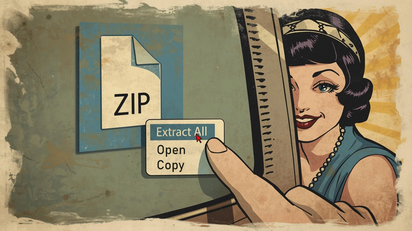
Step 1: Unzipping Your Vintage Treasure
(Yes, it’s just a ZIP file… but let’s do it with a little style.)
This is step by step from the beginning – in case you know how to open and unzipped you can right jump –> to the PDF section
You’ve got your download – that neat little ZIP packed with all the faded, distressed goodness. Time to set it free.
Here’s the no-nonsense way (with a tiny wink):
- On Windows: Right-click the file → “Extract All” – choose a spot and let it do its thing.
- On Mac: Double-click the ZIP – it magically unpacks itself like a well-behaved old journal.
- On your phone/tablet: Grab a decent unzip app (RAR, Files by Google, whatever) – just make sure it doesn’t mangle the file names.
Personal pro tip from someone who's rescued more crumpled downloads than she'd care to count: I always extract the ZIP file right where it is. After extracting, I move it to my Planner directory. Give it a name that feels right! It just... sets the mood, you know?

Step 2: Opening the PDF – Where the Magic Quietly Begins
Once your files are unpacked and sitting pretty in that lovingly named folder, it’s time for the gentle reveal.
If you already have a PDF reader or know everything about PDF readers, you can jump right to the Printer Settings.
Double-click the PDF you want to print.
Here’s my no-fuss recommendation lineup for viewers (from someone who’s cursed at too many glitchy previews over the years):
- Adobe Acrobat Reader – Still the quiet king. Free, reliable, and it actually respects all those delicate faded layers and subtle bleeds. My personal forever-favorite for vintage prints because it handles the grunge without flattening it. Grab it straight from the official spot: Download Adobe Acrobat Reader here – just pick your OS, hit download, and follow the simple installer. Takes two minutes, tops.
- Foxit PDF Reader – The speedy, lightweight alternative if Adobe feels too… corporate. Super fast and less bloat – I ♥ it. Free as well. Head over to the official page: Download Foxit PDF Reader here – same deal, quick install, no drama.

Pro tip from endless late-night printing sessions: Once installed, set one of them as your default PDF opener (right-click a PDF → Open with → Choose another app → check "Always use this app"). Saves you from the eternal "Which program?" dance.
Zoom right in to 100% (or even 150% if you’re feeling nosy), scroll slowly. Notice how the paper looks gently worn, how the ink has that faint, lived-in softness, how those little imperfections whisper “I’ve been waiting in a drawer for decades.” That’s not sloppy design – that’s the whole point. Take your time here. This is where you fall a little more in love with the thing.
Step 3: Printer Settings – Where the Faded Dreams Finally Meet Paper
Alright, this is the part where most people quietly sabotage their own vintage magic. Not you. Not today. We’re going to turn those washed-out digital beauties into tangible, slightly imperfect, beautifully lived-in printouts that feel like they’ve been hiding in an attic since the 1920s.
I’ve printed way too many of these distressed planners (hundreds, seriously), through every kind of ink situation imaginable. Whether you’re rocking original cartridges, a laser printer, a trusty refillable eco-tank (my personal long-term love) or something in between – the settings are what matter. Here’s what actually delivers that authentic, lived-in look, straight from countless trial-and-error nights.
3.1. Paper – The Quiet Hero
Regular 80 g copy paper? It works… but it feels like printing on sadness. Give your planner the respect it deserves:
My absolute go-to favorites that I keep coming back to:
- Navigator 120 g/m² Silky Touch Ultra-Bright Ultra-Smooth – Oh, I love this one!!! It’s my go-to for weekly and monthly pages. That silky, ultra-smooth surface with EU Ecolabel certification gives the most exquisite print quality – colors pop gently, textures breathe, and the distressed details look like they’ve aged to perfection. No bleed, beautiful ink hold, and it feels premium without being fussy.
- Navigator Expression 90 g/m² – Perfect for daily pages where you want something lighter but still reliable – great flow without bulk.
- Clairefontaine 120 g/m² – This one has a slightly rougher, more textured surface (in the best way), and it’s simply gorgeous for that authentic vintage grip.
- Mondi Color Copy with its satiny finish – Comes incredibly close to the Navigator 120g/m² magic, super recommend if you want that soft sheen and flawless color reproduction.
For monthly pages (or if you just crave something sturdier), bump it up to 160 g/m² – I swear by Navigator Office Card for that extra stability without losing the charm.
And for dividers? I print those on 280 g/m² Mondi Color Copy (white, satiny) – thick, luxurious and tough enough to survive endless flipping.
Everything I’ve raved about here is suitable for both color inkjet and laser printers – no drama, just reliable faded glory.
Here’s that cozy, anticipatory moment when the good paper meets the tray – pure vintage ritual. Click “Print” in your PDF viewer or reader:
3.2. Size & Scaling – Preserve the Full Faded Glory
First things first – before you even start fiddling with scaling, make sure you’ve actually picked the right printer up there in the top-left corner of the print dialog. Yes, that tiny dropdown menu that looks innocent.
Now, the real heart of scaling:
A4 (Europe) or US Letter. In the print dialog: →
- Actual Size / 100%
- No scaling – no “Fit To Page”
- Auto-Center or “Center”
One quick word about scaling 100%: I always bump it to 101% and suddenly you’ve got that precious roughly 1 mm buffer – perfect for bleed/trim allowance. When you later cut, hole-punch or bind, you still have the actual intended size left
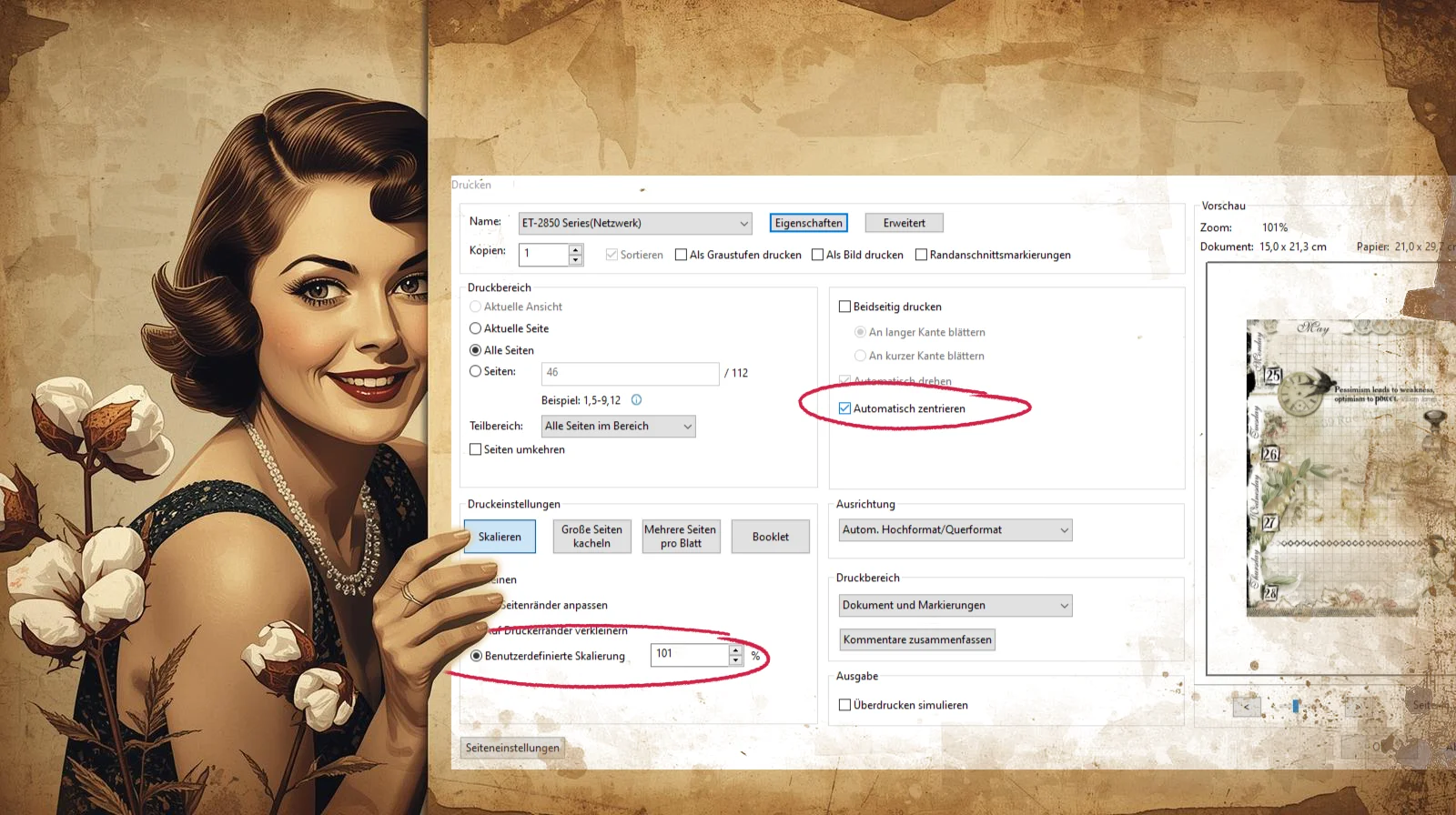
Okay, we’ve got our paper loaded, scaling bumped to that genius 101% and the basics locked in. Now it’s time to click that sneaky little “Properties” button – right up top, cozy next to your printer’s name like it’s whispering secrets. A whole new window pops open. Welcome to the inner sanctum. This is where we stop being polite and start getting gloriously specific.
Let’s dive into the basics:
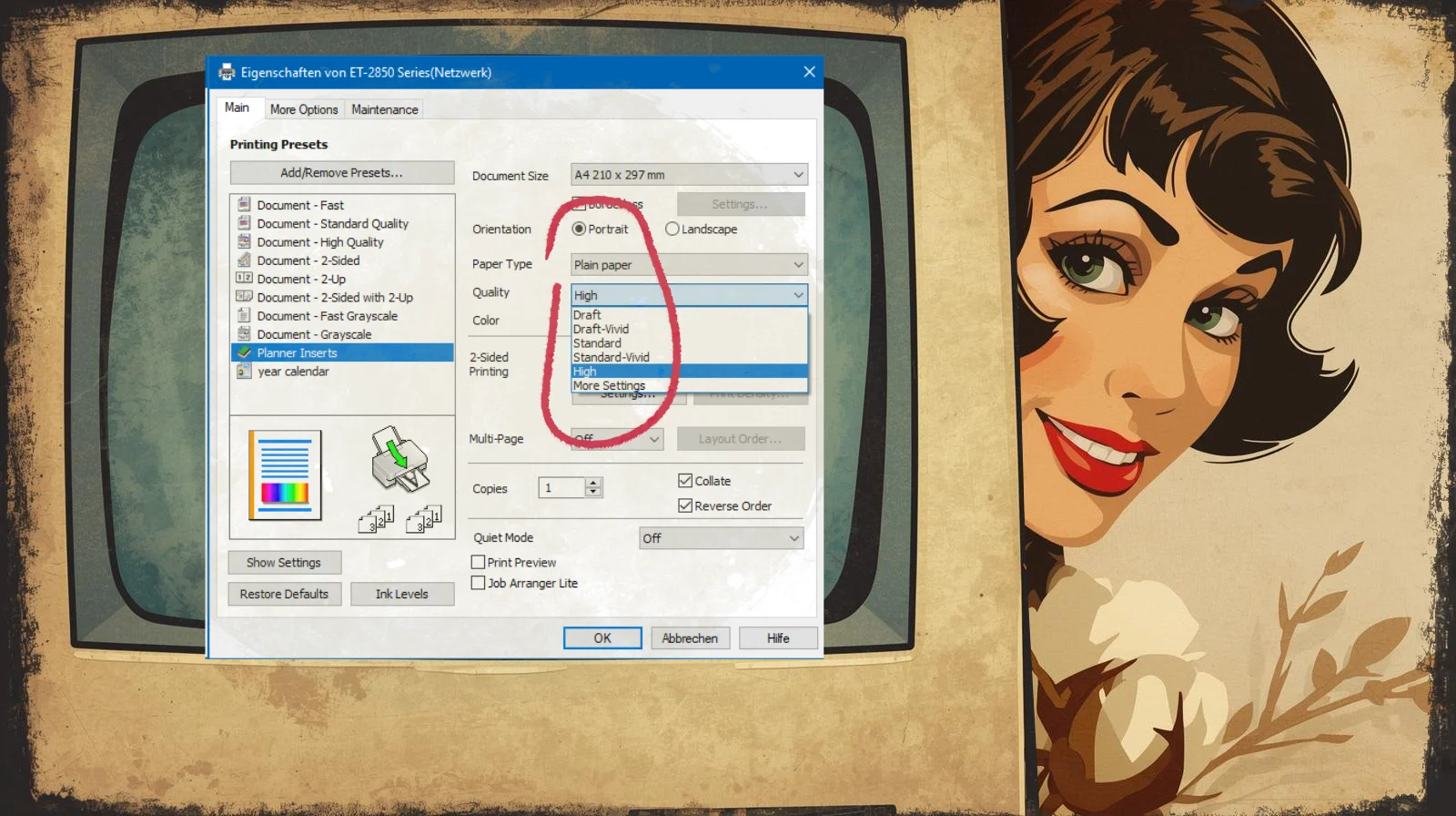
3.3. Print Quality
High or go home. Set it to High or Best (whatever your printer calls its non-lazy mode). Inkjet absolutely sings here. That soft, natural bleed? The way the ink kisses the paper like it’s been waiting decades to do so? That’s the vintage soul we’re chasing. Don’t settle for draft mode – your distressed florals deserve better.
- Under Quality → High
- Under Paper → Plain Paper (yes, if we print weeklies, monthlies, dailies and you’re using 120 g/m² or 160 g/m² or 90 g/m²)
- Orientation → Portrait
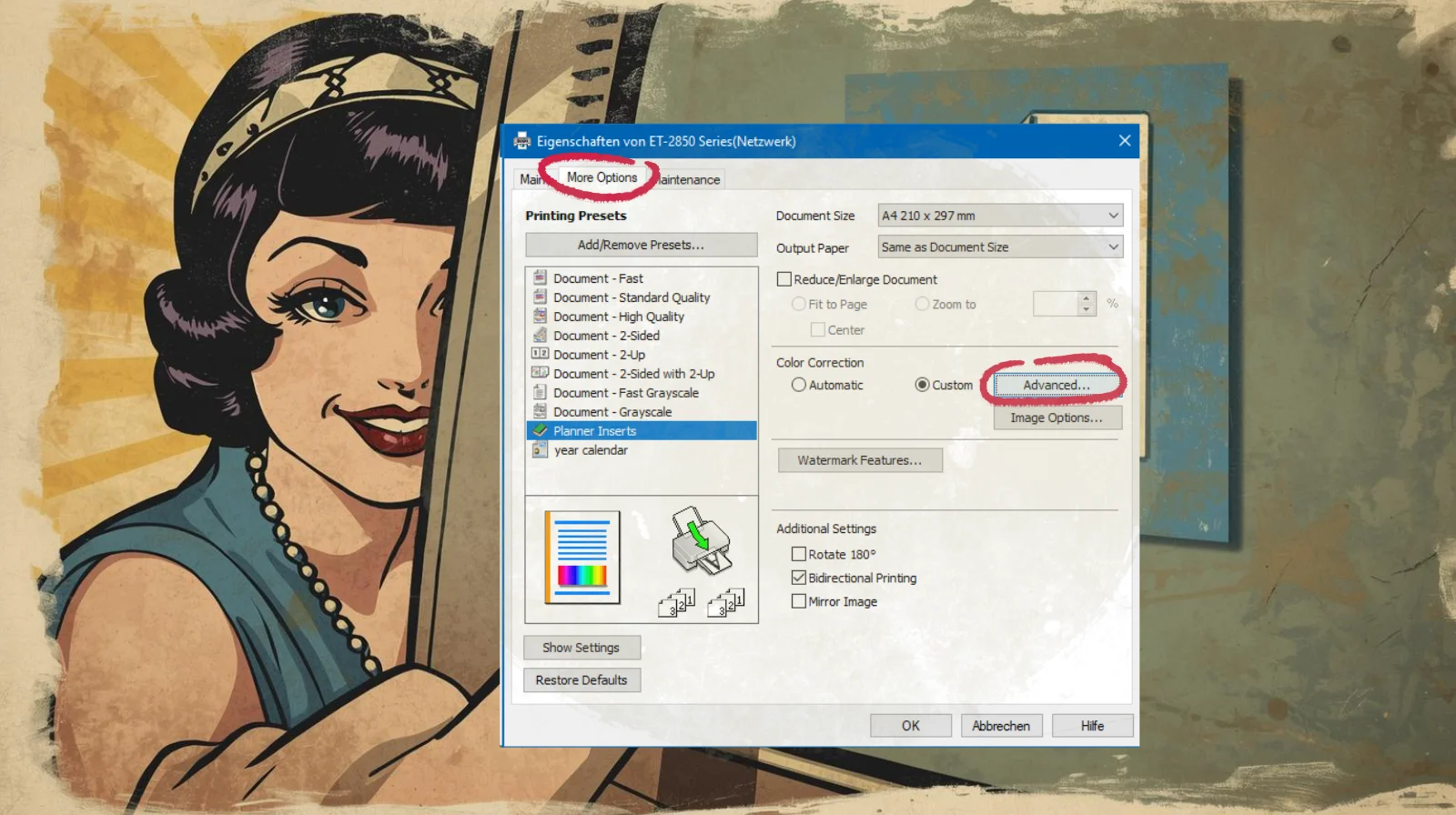
Quick side note: Ignore that tempting “Planner Inserts” preset on the left in the example screenshot. That’s my personal saved preset, born from years of obsessive tweaking. Yours won’t have it… yet. But once you nail these settings? Save them as your own secret weapon. Call it “My Planner Dream” or something equally dramatic.
Now, hop up to the top tab: More Options.
Here we go – the part where I spill my actual secret sauce.
Click under Color Correction → Custom → Advanced.
And now …
my personal secret settings 🤫
- Color Mode: Check the top left – Color Controls
- Use Color Mode: I go for anything “Vivid” (Epson Vivid is my eternal love – it wakes up those muted sepias and earthies without turning them neon). RGB mode does the job too if your printer doesn’t have a vivid option.
- Use Slide Bar (the fun part):
- Brightness: +9 (just enough lift to keep things from going muddy)
- Contrast: +5 (gentle – we want soft aged charm, not harsh drama)
- Saturation: +10 (a tiny boost so the faded pastels still whisper instead of shout)
On the right side sliders (the fine-tuning heroes):
- Yellow: +10 (this little yellow nudge makes those vintage creams and old-paper tones glow just right – without going banana-yellow)
- Cyan: 0
- Magenta: 0
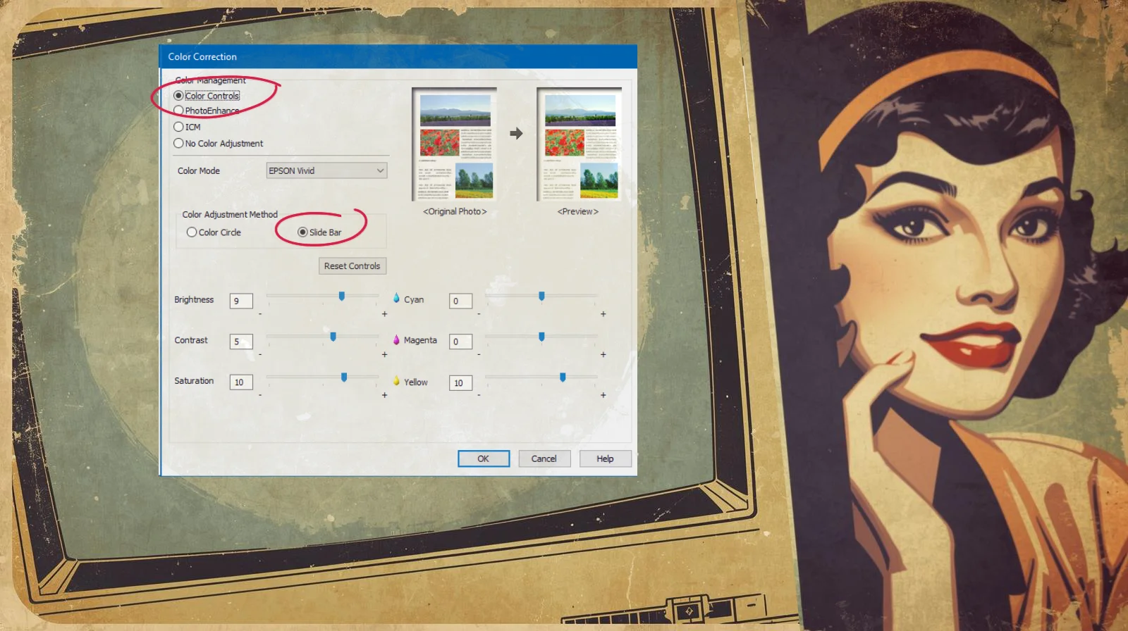
Important reality check: This is my setting. Born from my Epson eco-tank, my favorite Navigator 120 g/m² Silky Touch and endless test prints at 2 a.m. Your printer? Your paper? Your ink? All different beasts. So treat this as a starting point, not gospel. Print a test page, hold it up to natural light, squint, curse a little, then tweak. Think it’s too saturated? Lower Saturation to “+5”. Test again and tweak! That’s the ritual. That’s how you make it yours.
Once you’re happy (or at least less grumpy), hit OK at the bottom, slide back to the main print window…
Quick Pre-Print Reality Check
- Paper loaded right side up
- Ink healthy
- Tray correct
- Preview and zoom in – make sure the textures whisper
… and finally, lady — Print.
Stop!!! — not yet.
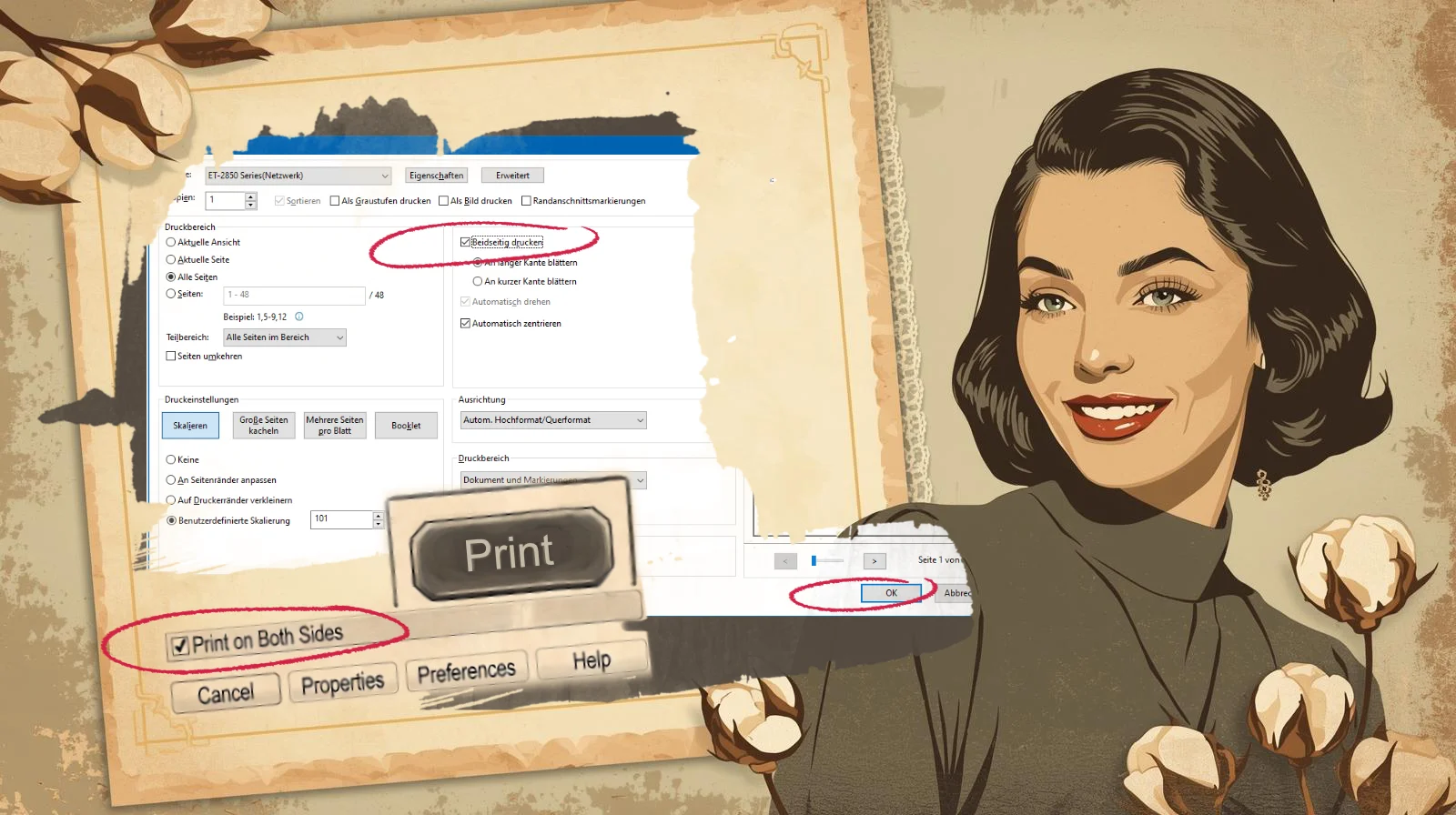
3.4. Automatic Double Sided Printing – Duplex Printing
If your printer is one of those civilized beasts that can do double-sided printing (and most decent inkjets these days are), look for that innocent little checkbox: Print on Both Sides / Double-Sided / Duplex (wording varies, but it’s usually lurking somewhere near the bottom or in a “Finishing” tab). That’s the relaxing part of this vintage planner print guide – no manual flipping required, just pure faded-nostalgia magic on both sides.
Check that box. Choose Flip on Long Edge (for proper booklet-style turning – the vintage way) unless you want your planner to read like a flip-book gone wrong. Then – and only then – click Print (or OK, depending on how dramatic your driver is feeling).
Personal confession from someone who’s wasted more paper than I’d like to admit: I not only once forgot the double-sided box – I printed single-sided, had to re-do everything, cried a little, and learned the hard way. Don’t be me. Check the box. Save the trees. Save your sanity. Save the drama for the textures, not the printing.
3.5. Planner Print Guide Tip: Double-Sided Printing – The Manual Flip of Fate
If your printer doesn’t have that handy “Print on Both Sides” checkbox – the one that’s conspicuously absent – staring back at you like it’s got better things to do… don’t panic. It’s not a tragedy. In this planner print guide, I show you how to print double-sided though. It’s just one of those little reminders that not every printer out there has embraced the auto-duplex life – even in 2026, plenty of perfectly capable machines (especially budget inkjets, compact models or certain office lasers) still expect you to do the flipping yourself.
The truth? Every printer can print double-sided. The only difference is: some do it for you like a polite butler, others make you earn it like a true vintage warrior. And girl, we’re earning it today.
Here’s how the manual flip works in real life (from someone who’s flipped more stacks than she’d like to admit on rainy afternoons – and yes, I still do it often, even with “modern” printers):
The Two Most Common Scenarios
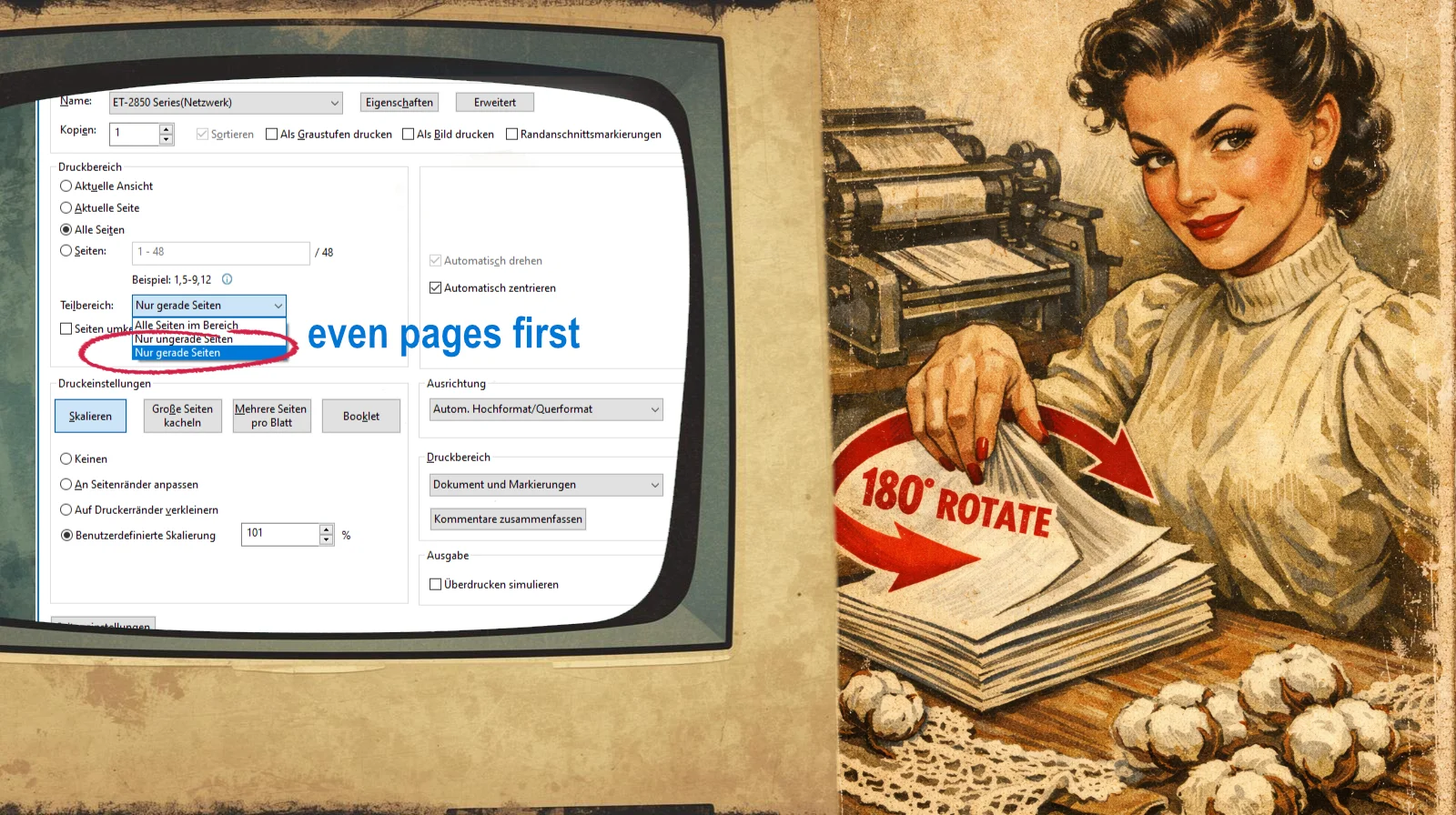
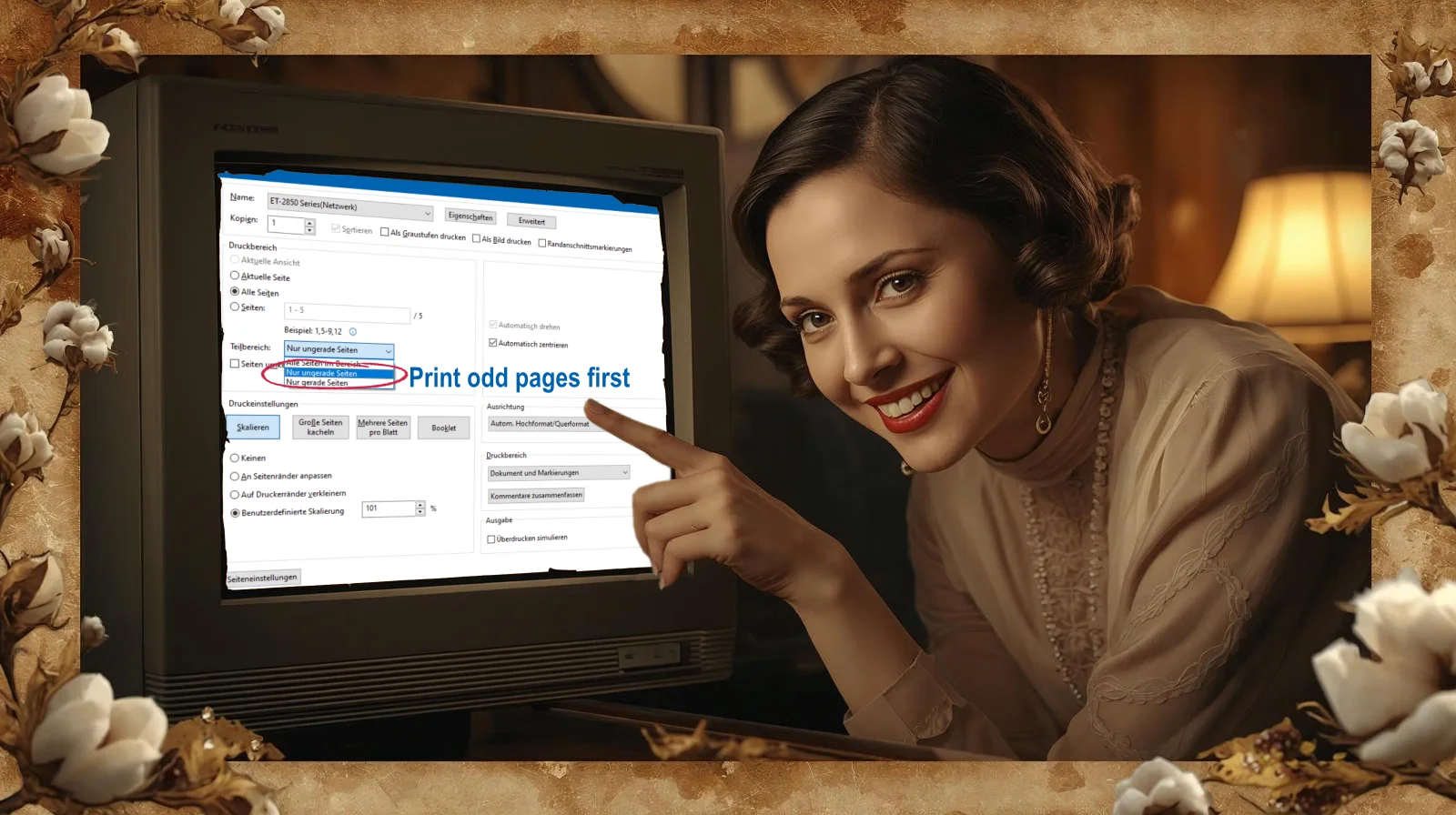
1. Printer with rear paper tray / rear feed
- Print only the even pages first (in your print dialog: Pages → “Even pages only”)
- Let the stack come out.
- Take the entire printed stack.
- Flip the entire stack 180° along the long edge (turn it upside down and over so that: – the top edge becomes the bottom edge – the previously printed side now faces DOWN)
- Place it back into the rear tray exactly as it is now (printed side facing down, no additional rotation)
- Now print the odd pages → Voilà! Perfect double-sided, front-to-back, ready for your binder rings and lace trims.
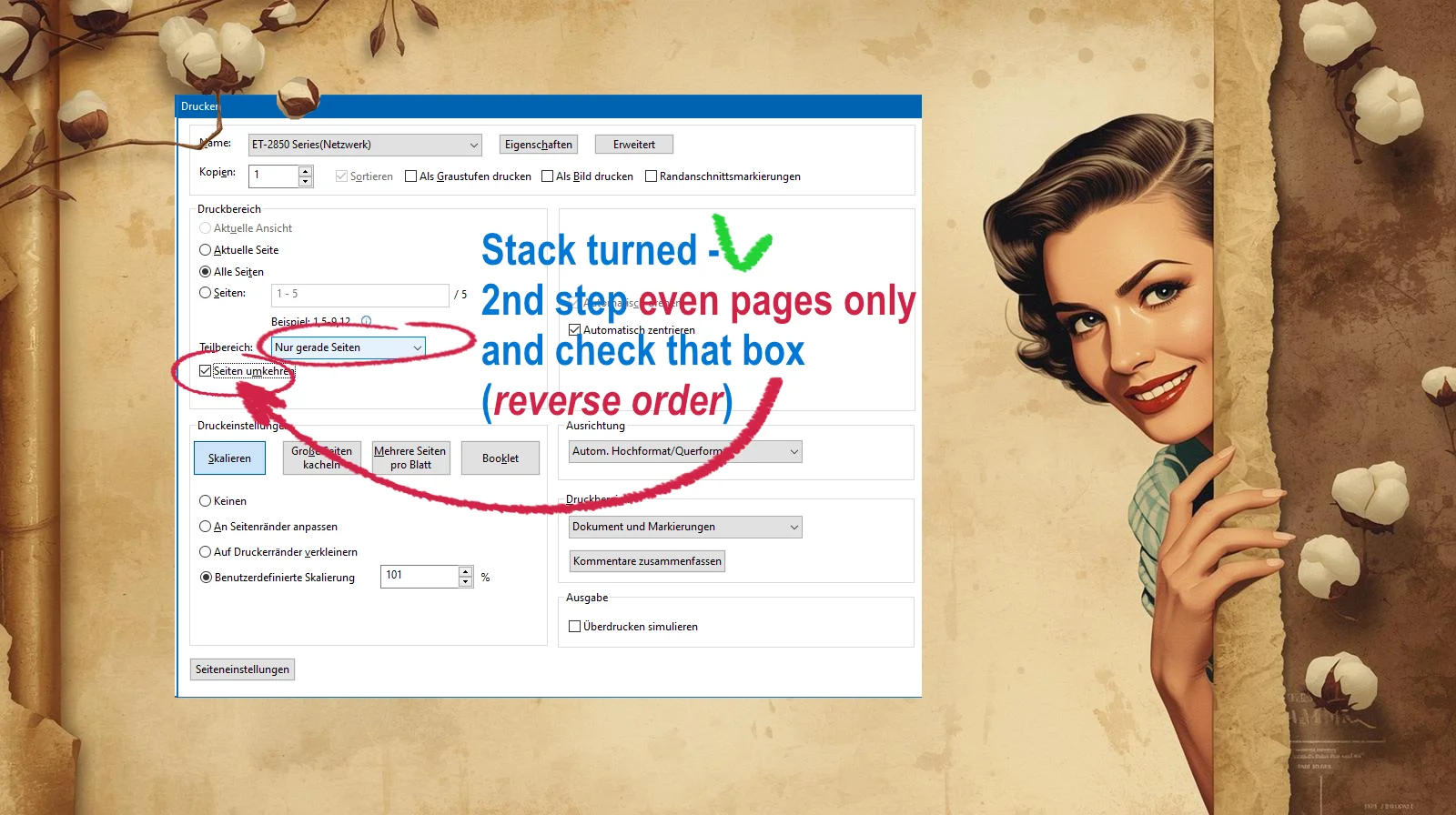
2. Printer with front/bottom tray
- Print odd pages first
- Remove the stack.
- Rotate the stack 180 degrees without flipping it over (the printed side must remain face up).
- Reinsert the stack into the tray, leading with the edge that was previously closest to you.
- Print the even pages. → In reverse order (check that box! – see image below)
- The pages will come out in the correct order, right side up, ready for trimming & punching.
Pro Tips from the Trenches
- Always do a tiny test run (pages 1-4) first. To do this, select Draft and Black & White or Grayscale in the settings. Trust me. I’ve flipped entire planners the wrong way and had to start over. Never again.
- Label your stack with a sticky note: “Even – printed – rotate 180°” or mark with a cross at the top or bottom – because 2 a.m. brain is not to be trusted.
It’s a bit more work, sure. But there’s something oddly satisfying about manually flipping your faded beauties – like you’re reminding the machine: “I don’t need your fancy auto-features. I’ve got hands, patience and a questionable amount of coffee.”
This is the heart of it. The Heart Of Planner Print Guide. I’d say, lady … you’ve got this.
Want to get even more knowledge? For example:
- You want to know – how to cut the pages?
- How to punch the freshly printed planner inserts?
to be continued …. stay tuned