I had been thinking for quite a while about how I could design the perfect planner for myself.
I knew one thing for sure: I need space. A lot of space. I always write more than I think I will. Weekly layouts look nice, but for me they usually end up being just a quick overview. My actual planning happens daily — and it tends to expand.
I would fill the day with notes, then continue in a separate notes section… and a few days later I would look at those notes and wonder: What was this about? And when was it even due?
And I didn’t want to create just another digital planner.
I wanted something that feels good to open. Something that makes you want to plan. Something that unfolds day by day instead of repeating the same layout over and over again.
The vintage aesthetic was never a question. You know me – it had to feel warm and timeless. Not overly colorful. But also not plain black and white. I wanted balance. Calm, but not empty.
And that’s where the Vintage Daily Digital Planner 2026 began.
If you’re new to digital planning, you can explore the full Digital Planners section here.
Design Decisions Behind This Daily Digital Planner
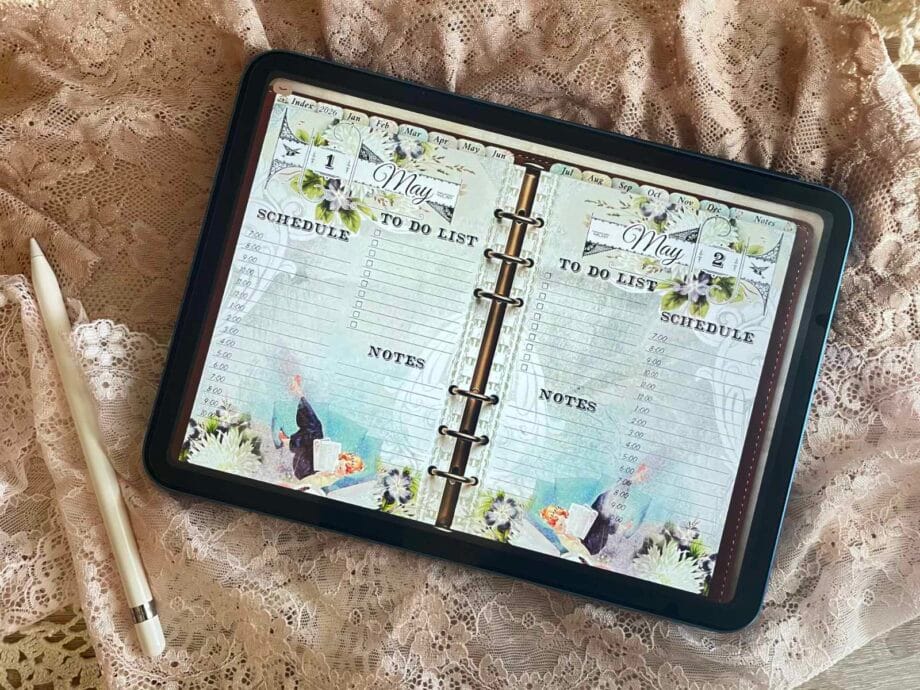
Once I realized I needed at least one full page per day, the idea of a true daily planner was born.
I created a simple structure for each day – a light schedule for the morning, a proper to-do list (because that’s where the real plans live), and of course space for notes. I always need room to capture whatever comes to mind. Thoughts, reminders, random ideas – everything needs a place.
That’s how the 365 daily pages came to life. One page for every single day. No repeating weekly spreads. No squeezing things into tiny boxes. Just enough space to actually plan.
To make everything easy to access, I added an index page. Each month links directly to the first day of that month, and from there you can quickly scroll or navigate wherever you need to go.
I also wanted a clear annual overview – a place where you can see the entire year at a glance.
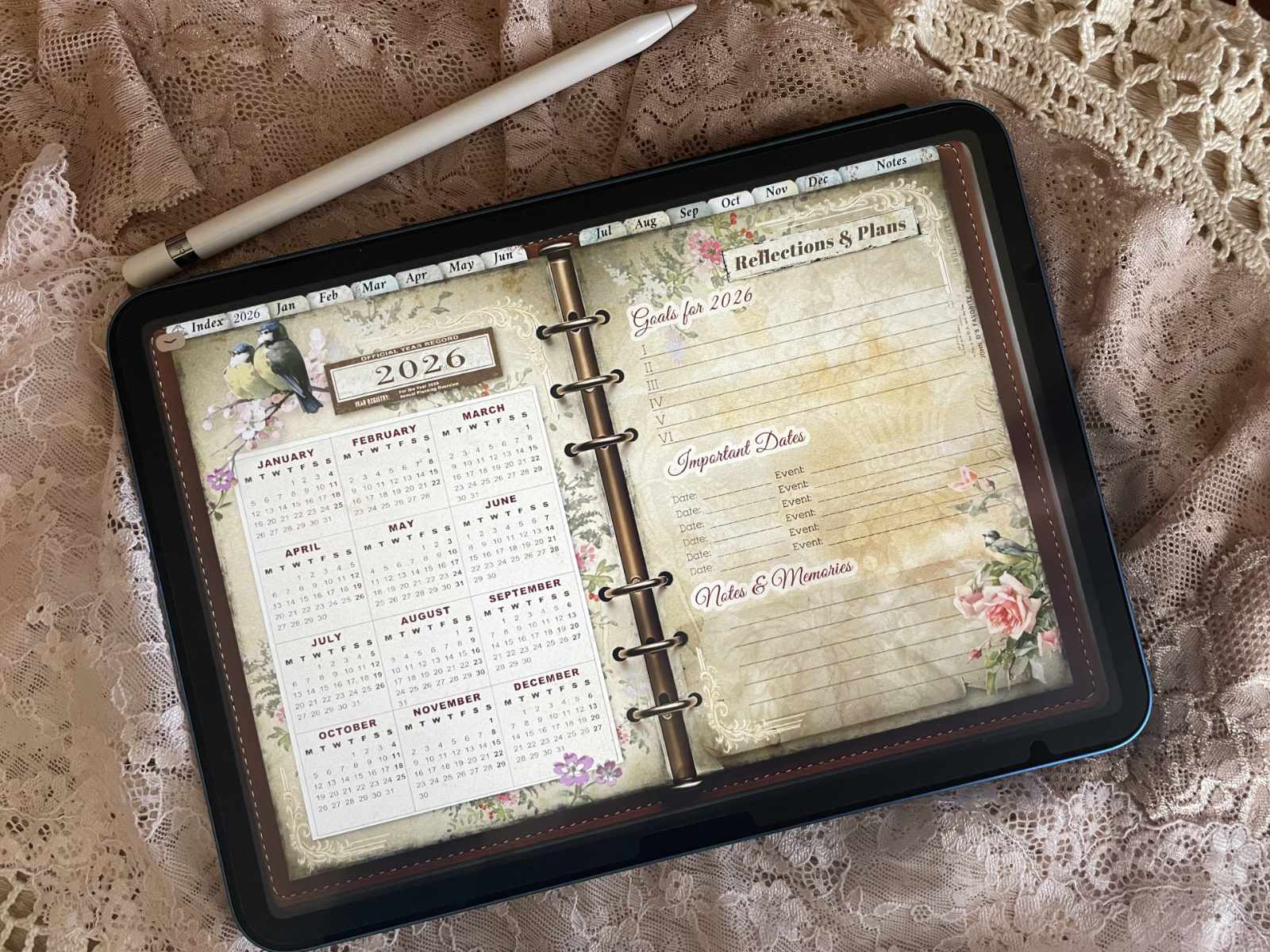
And because I know some people start their week on Sunday and others on Monday, both versions are included.
Right next to the yearly overview, I added a dedicated page for bigger goals and important dates. This is where long-term plans live. I use it to keep track of key events, milestones, and short reflections — small notes about things that shouldn’t be forgotten.
And because a planner of this size needs to feel effortless to use, I added clean, hyperlinked tabs at the top.
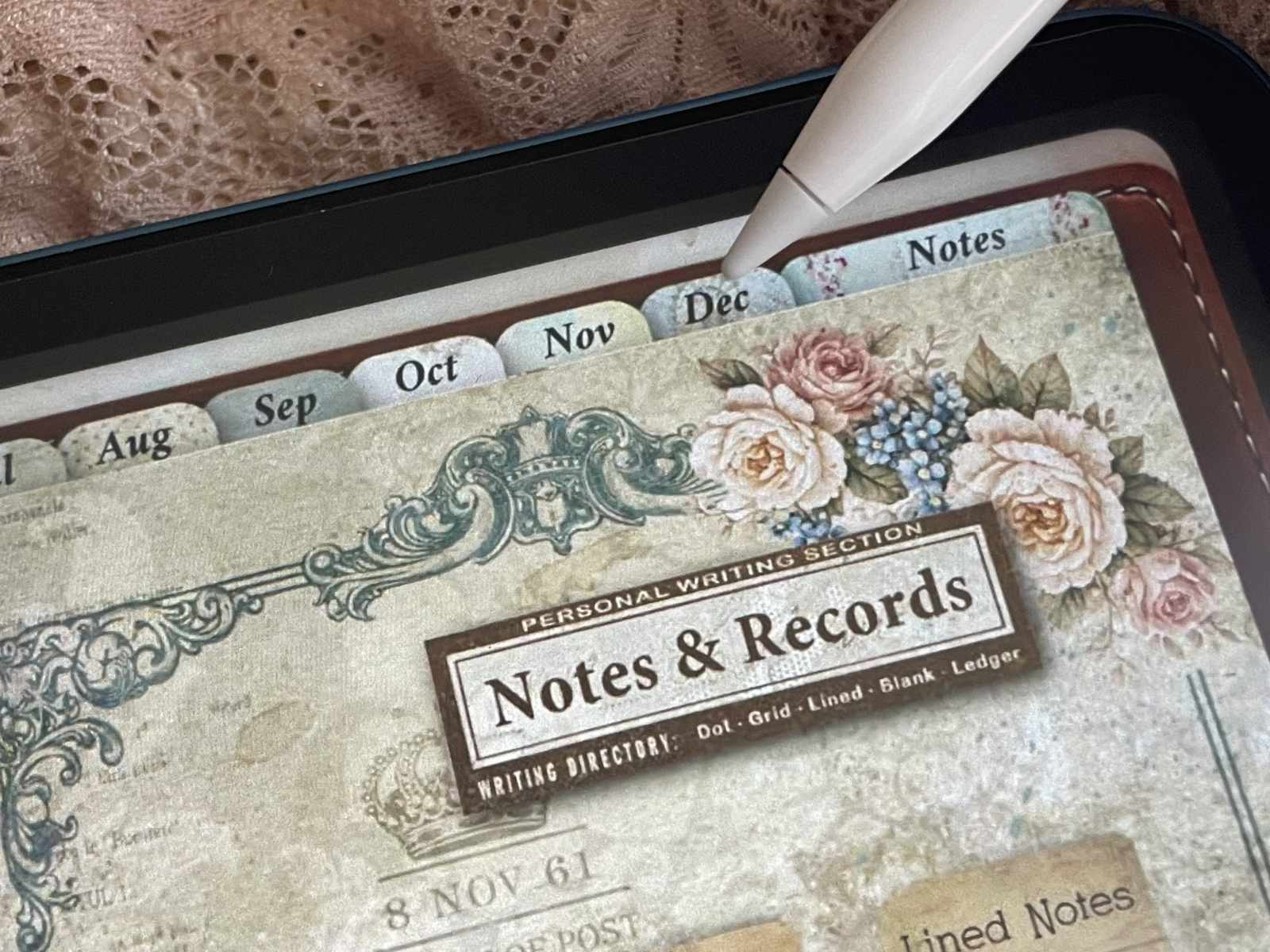
Everything is easy to reach. No endless scrolling. Just tap and go.
If you’d like to see the planner in action, I recorded a full walkthrough…
For Who This Planner Is (and Isn’t)
This planner isn’t for everyone – and that’s intentional.
Maybe you love a clean, ultra-minimal layout. Lots of white space. The same structure every single week. And that’s absolutely fine.
But that’s not me. It never was.
If you love vintage aesthetics, if you enjoy writing on beautiful, warm backgrounds instead of plain white pages, if you appreciate variety and subtle details – then this might feel like home to you.
Every day begins with a new morning. A new page. A fresh start.
This isn’t a planner that simply repeats the same layout fifty-two times.
Some planners repeat. This one unfolds.
It’s made for those who don’t just want to plan their days — but want to experience them.
For people who write a lot. Who reflect. Who keep track of small thoughts and big goals alike. Who enjoy structure, but don’t want it to feel cold or mechanical.
If that sounds like you, then maybe I didn’t just design this planner for myself after all.
Explore the Full Vintage Daily Digital Planner 2026
You can explore the full Vintage Daily Digital Planner 2026 in more detail if you’d like to see how everything comes together.
Inside, you’ll find 365 daily pages, a complete yearly overview, dedicated goal sections and fully hyperlinked navigation designed for effortless planning in GoodNotes.
There are two versions available – a high-quality edition for those who love every little detail, and a lighter version for smoother performance on your iPad.
If you’re curious, you can take a closer look here.
Planning should feel inspiring – not repetitive.